Ask ten business owners what “brand identity” means, and at least seven will say “a logo.” It’s an understandable mistake—the logo is the most visible piece. But it’s also the smallest piece of a much bigger system.
A real brand identity is a complete toolkit that determines how your business looks, sounds, and feels across every touchpoint—your website, your packaging, your social media, your pitch deck, and even the tone of your customer support emails. Get it right, and your brand becomes instantly recognizable and consistently trustworthy. Get it wrong (or skip it entirely), and your business looks different everywhere it shows up — which quietly erodes trust before a customer even reads a word.
At De Viannies Studio, brand identity is one of our core services, and we’ve built complete systems for startups, e-commerce brands, and growing companies across multiple industries. In this guide, we’ll walk through exactly what a brand identity system includes, why each component matters, and how to know whether your business is ready for one.
Brand identity vs. logo: What’s the difference?
A logo is a single mark—a symbol, wordmark, or combination that represents your business visually in its simplest form.
A brand identity is the complete visual and verbal language of your business. It includes the logo but also defines the following:
- The colours you use and what they communicate
- The typography that shapes how your text feels
- The visual style of your photography, illustration, and icons
- The tone and voice of your written communication
- The rules for how all of these elements work together across different contexts
Think of the logo as a single word, and the brand identity as the entire language. You can have a great logo and still have a confusing, inconsistent brand if nothing else is defined.
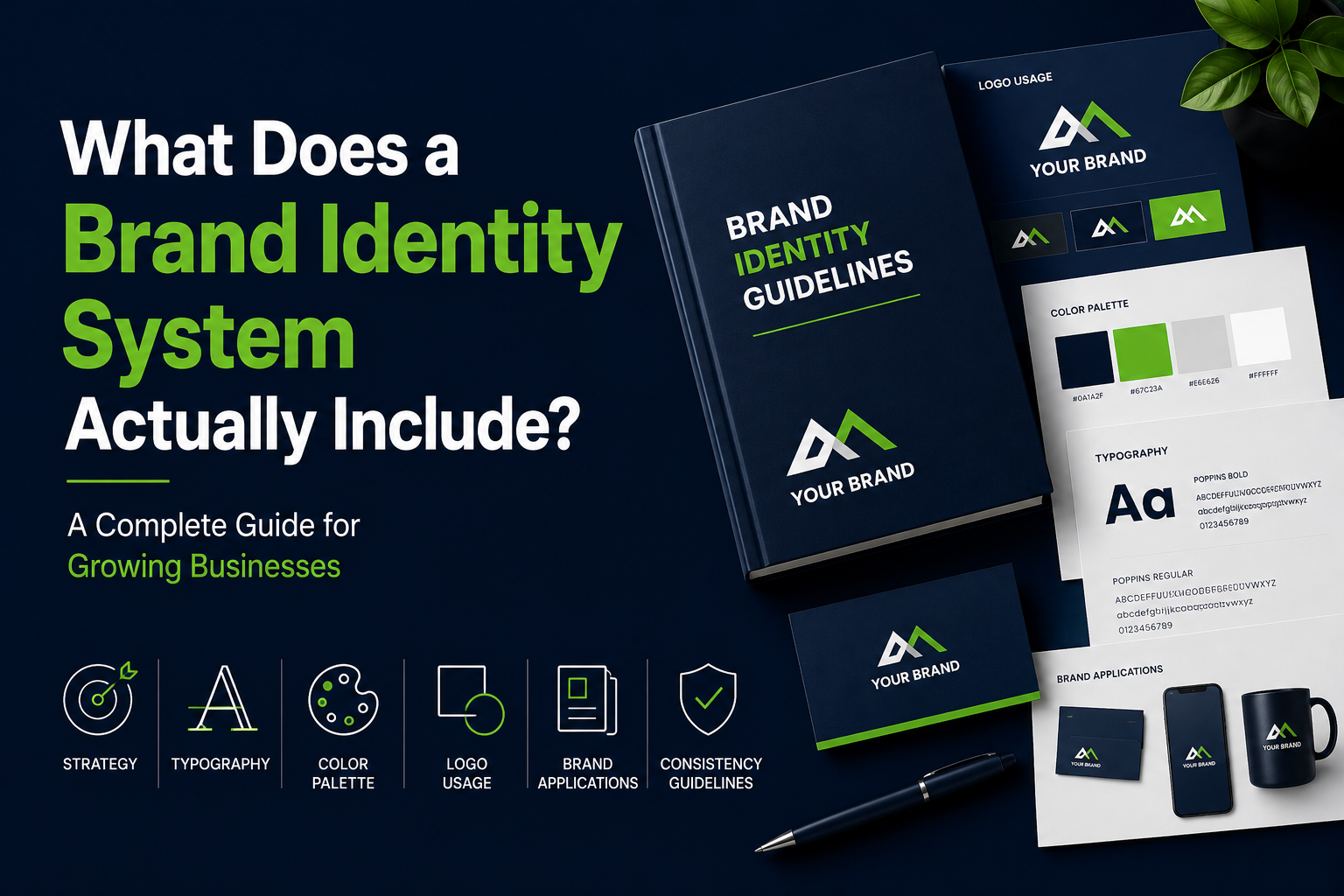
The core components of a brand identity system
Here’s what a genuinely complete brand identity system includes—and what each component is actually for.
1. Brand strategy
Before any visuals are created, a brand identity starts with strategy: who you’re for, what you stand for, how you’re different from competitors, and what feeling you want people to associate with your business. This usually includes:
- Brand positioning — where you sit in the market relative to competitors
- Target audience definition — who you’re designing for
- Brand personality — the human traits your brand should embody (e.g., bold, warm, precise, playful)
- Core messaging — your value proposition, tagline, and key messages
Skipping this step is the most common reason brand identities fail. Without strategy, visual decisions become subjective opinions instead of informed choices grounded in what your audience actually responds to.
2. Logo system
A complete logo system isn’t just one file—it’s a flexible set including:
- Primary logo — the main, full version of your mark
- Secondary/alternate logos — simplified versions for smaller spaces (icons, favicons, app icons)
- Lockups—variations combining logo with tagline or different orientations (horizontal, stacked, vertical)
- Logo usage rules—minimum sizes, clear space requirements, and what not to do (stretching, recolouring, placing on busy backgrounds)
A single logo file with no system behind it is the number one reason brands look inconsistent the moment they need to use the logo somewhere unexpected—a favicon, a large banner, or an embroidered patch.
3. Colour palette
A real color system includes more than “brand colors.” It defines:
- Primary palette—your main brand colours, typically 1–3 colours
- Secondary/accent palette—supporting colours for variety and hierarchy
- Neutral palette — greys, off-whites, and blacks for text, backgrounds, and balance
- Exact specifications — HEX, RGB, CMYK, and Pantone values so colours render identically across digital and print
- Usage guidance—which colours pair together, and which combinations to avoid
Color is one of the fastest ways humans recognize a brand—but only if it’s used consistently. A palette without usage rules tends to drift over time as different people interpret “brand colours” differently.
4. Typography system
Typography shapes how your brand feels before anyone reads a single word. A typography system defines:
- Primary typeface — used for headings and major brand moments
- Secondary typeface — used for body text and supporting content
- Type hierarchy — how headings, subheadings, body text, and captions relate in size and weight
- Licensing and fallback fonts — ensuring fonts work across web, print, and platforms that don’t support custom fonts
Many businesses pick a typeface because it “looks nice” without considering legibility at small sizes, licensing costs for commercial use, or how it pairs with a secondary font. A proper system avoids all of this guesswork.
5. Visual language
This is where a brand identity becomes distinctive rather than generic. Visual language includes:
- Photography style—lighting, composition, colour grading, and subject matter guidelines
- Illustration style—if your brand uses illustrations, defining the style (flat, line-based, 3D, hand-drawn)
- Iconography — a consistent icon set that matches your brand’s visual style
- Graphic elements/patterns — shapes, textures, or motifs unique to your brand
- Imagery do’s and don’ts — examples of on-brand vs. off-brand visuals
This is often the most overlooked component — and the one that makes the biggest difference in how premium or generic a brand feels.
6. Brand voice and messaging guidelines
Visual identity is half the story. The other half is how your brand sounds. This includes:
- Tone of voice — formal vs. casual, technical vs. approachable
- Writing guidelines — sentence length, vocabulary preferences, things to avoid
- Taglines and key messaging — core phrases that communicate your value
- Examples — sample copy showing the voice in action across different contexts (website, social, email)
A brand that looks premium but sounds careless (or vice versa) creates a disconnect that customers feel even if they can’t articulate it.
7. Brand guidelines document
Everything above gets compiled into a single reference document—often called “brand guidelines,” “a brand book,” or “a style guide.” This document is what keeps a brand consistent as your team grows, as you hire freelancers, or as you expand into new markets. A good guidelines document includes real examples, clear rules, and enough detail that someone unfamiliar with your brand could apply it correctly.
8. Application templates
A brand identity isn’t complete until it’s been applied to real materials. This typically includes templates for:
- Business cards and stationery
- Social media post templates
- Email signatures
- Presentation/pitch deck templates
- Packaging (if applicable)
- Website-style application
Seeing the brand applied to real-world materials is often what reveals gaps in the system—and it’s where many DIY brand identities fall apart, because the logo “looked fine” in isolation but doesn’t translate well to an Instagram story or a product label.
Why a complete system matters more than a great logo
Here’s the uncomfortable truth: you can have a beautifully designed logo and still have a weak brand identity. A logo with no colour system, no typography rules, and no usage guidelines will get reinterpreted differently by every person who touches it — your social media manager picks different colours, your web developer uses a different font, your packaging supplier crops the logo wrong.
The result is a brand that looks like five different companies depending on where you encounter it. And inconsistency, even subtle inconsistency, registers subconsciously as a lack of credibility.
A complete brand identity system solves this by giving everyone—your team, freelancers, agencies, and manufacturers—a single source of truth.
How long does building a brand identity take?
For a complete system covering strategy, logo, color, typography, visual language, and guidelines, expect
- DIY (using templates/tools): Weeks to months, with significant inconsistency risk
- Freelancer: 4–8 weeks for a complete system, often longer with revision cycles
- Agency: 8–16 weeks, with proportionally higher costs
- De Viannies Studio: Most brand identity projects are completed within 2–3 weeks, with unlimited revisions included as part of our design subscription
How much should a brand identity cost?
Costs vary widely depending on scope and provider:
- Logo only (no system): $200–$2,000—but this leaves you without the rest of the system
- Freelance brand identity (logo + basic guidelines): $2,000–$8,000
- Agency brand identity (full system): $10,000–$50,000+
- De Viannies Studio subscription: $1,500/month, covering brand identity plus ongoing design needs
For a deeper breakdown of pricing across the industry, see our companion post: Design Subscription vs Hiring a Designer — Which Actually Saves Money?
How De Viannies Studio approaches brand identity
Every brand identity project at De Viannies Studio starts with a discovery conversation—understanding your business, your audience, and your competitors before any design work begins. From there, our process typically covers:
- Brand strategy session — defining positioning, personality, and messaging direction
- Logo concepts — multiple directions explored before refining the chosen direction
- Colour and typography system—built around the strategy, not personal preference
- Visual language exploration — photography, illustration, and iconography direction
- Guidelines documentation — a complete reference document for your team
- Application design — applying the system to real materials so you can see it in action
You can browse examples of completed brand identity projects in our portfolio and see the full range of what’s included in our services.
If you’re not sure whether your business needs a full system or just a refresh, book a free 15-minute call and we’ll help you figure out what’s actually needed.
Signs your business needs a brand identity system
Not sure if this applies to you? Here are common signs:
- Your logo exists in multiple versions because nobody knows which is “correct.”
- Your social media, website, and printed materials all look like they belong to different companies
- You’ve hired freelancers and gotten wildly different visual results each time
- You’re preparing for fundraising, a major launch, or expansion and need to look credible to new audiences
- You’ve outgrown a DIY logo made years ago and it no longer reflects where your business is now
If two or more of these sound familiar, a brand identity system isn’t a “nice-to-have”—it’s overdue.
Summary
A brand identity system is far more than a logo — it’s the complete visual and verbal toolkit that keeps your business looking and sounding like itself everywhere it shows up. It includes brand strategy, a logo system, color and typography systems, visual language, voice guidelines, a documented style guide, and real-world application templates.
Skipping any of these pieces leaves gaps that show up later as inconsistency—and inconsistency quietly costs trust. Building a complete system upfront, even a lean one, sets your business up to look credible and cohesive as you grow.
Explore brand identity services at De Viannies Studio →
Frequently asked questions
What is included in a brand identity system?
A complete brand identity system includes brand strategy (positioning, audience, and personality), a logo system (primary, secondary, and alternate versions with usage rules), a color palette with exact specifications, a typography system, visual language guidelines (photography, illustration, and iconography), brand voice and messaging guidelines, a documented style guide, and application templates for real-world materials.
Is a logo the same as a brand identity?
No. A logo is a single visual mark, while a brand identity is the complete system of visual and verbal elements that define how a business looks, sounds, and feels across every touchpoint. A brand can have a logo without a full identity system, but this often leads to inconsistency as the business grows.
How much does a complete brand identity cost?
Costs range from $200 for a basic logo with no system to $2,000–$8,000 for a freelance brand identity to $10,000–$50,000+ for an agency-built system. De Viannies Studio offers complete brand identity as part of a $1,500/month design subscription, which also covers ongoing design needs beyond the initial project.
How long does it take to build a brand identity?
Timelines vary by provider: DIY approaches can take months with inconsistent results, freelancers typically need 4–8 weeks, and agencies often take 8–16 weeks. De Viannies Studio typically completes brand identity projects within 2–3 weeks.
Do small businesses and startups need a full brand identity system?
Yes, particularly if the business plans to grow, hire additional team members or freelancers, expand into new markets, or raise funding. A documented system prevents inconsistency from creeping in as more people create materials for the brand. Even a lean version—logo system, color palette, typography, and basic guidelines—provides significant value early on.
What’s the difference between brand guidelines and a style guide?
The terms are often used interchangeably. Both refer to a documented reference that defines how a brand’s visual and verbal elements should be used—including logo usage, colors, typography, voice, and examples of correct and incorrect application. Some companies use “style guide” for a more design-focused document and “brand guidelines” for one that also includes strategy and messaging, but there’s no universal distinction.
Can a brand identity be updated later without starting over?
Yes. A brand refresh builds on an existing identity rather than replacing it entirely—updating the logo, refining the color palette, or modernizing typography while retaining brand recognition. A full rebrand replaces the system entirely and is typically done when a business has fundamentally changed its positioning or audience.