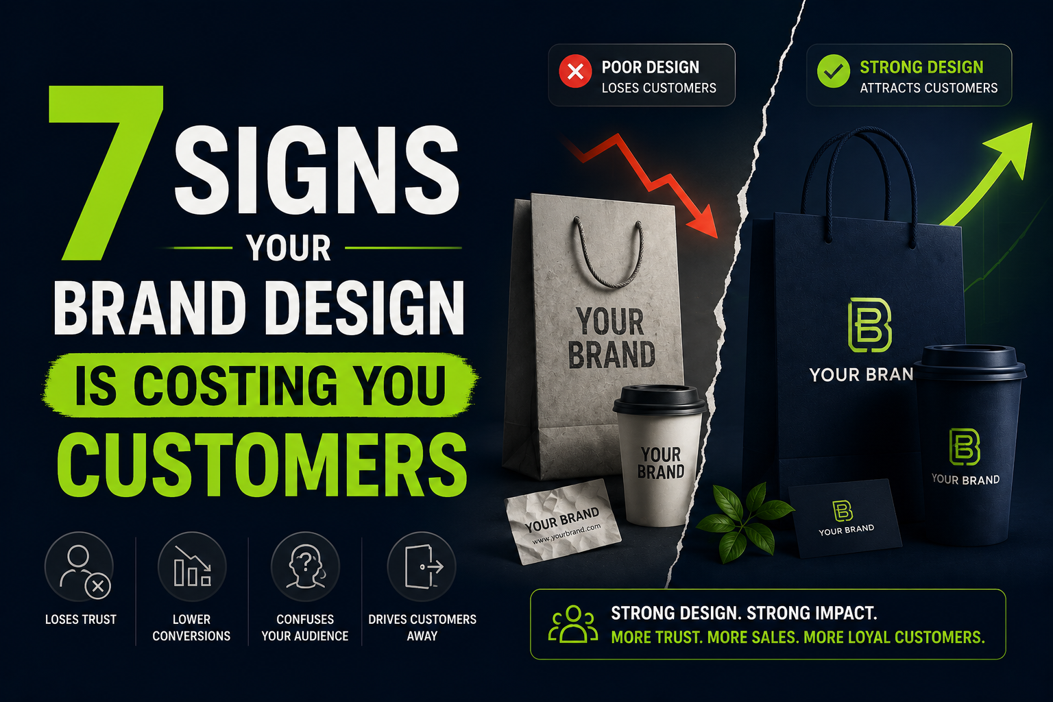
Here’s a scenario we see constantly at De Viannies Studio: a business has a solid product, a real customer base, and a marketing budget — but conversions are flat, traffic doesn’t convert into sales, and nobody can quite explain why.
They look at ad spend. They look at copywriting. They run A/B tests on button colors. What they rarely look at is the brand itself—the cumulative impression created by the logo, the website, the packaging, the social presence, all of it together.
Design problems are sneaky because they don’t show up as errors. Nothing is “broken.” The site loads, the logo displays, and the colors are technically fine. But something about the overall impression makes a visitor hesitate, scroll past, or quietly close the tab—and that hesitation costs real money.
Below are seven design issues we encounter again and again — each one quietly working against the business that has it.
1. Your brand looks different everywhere it appears
Open your website, your Instagram, your last email newsletter, and your business card side by side. Do they look like they belong to the same company?
For a surprising number of businesses, the honest answer is no. The logo on the website is a different version than the one on social media. The colors on the packaging don’t match the colors online. The fonts vary depending on who made the last graphic.
Why this costs you customers: Consistency is one of the strongest unconscious signals of credibility. When a brand looks different across touchpoints, people register—even subconsciously—that something feels “off,” even if they can’t say what. In competitive markets, that hesitation is often enough to send them to a competitor whose brand feels more put-together.
The fix: A documented brand identity system—covering logo usage, color specifications, typography, and visual style—gives everyone creating materials for your brand a single source of truth.
2. Your website looks like it was built five-plus years ago
Design trends shift. What looked modern in 2018 — heavy gradients, stock photography of people in suits shaking hands, generic rounded icons — now reads as dated, even if the underlying message is still accurate.
Why this costs you customers: Visitors make a credibility judgment about your business within seconds of landing on your site — long before they read any content. A dated design subtly signals “this business might be behind”—on technology, on relevance, on attention to detail. That impression colors how they read everything else on the page, including your pricing and your claims about quality.
The fix: A website refresh doesn’t always mean starting from scratch. Often it means modernizing the visual layer—typography, imagery, layout patterns, and spacing—while keeping your existing content and structure. De Viannies Studio’s WordPress development service is built specifically around fast, modern, conversion-focused builds.
3. Your UI makes people think before they click
Good UI design is invisible — users move through it without thinking. Bad UI creates friction: buttons that don’t look clickable, forms that are confusing, navigation that requires guessing, or critical information buried below the fold.
Why this costs you customers: Every moment of confusion is a moment where a user might give up and leave. In e-commerce, this shows up as abandoned carts. In SaaS, it shows up as signup drop-off. In service businesses, it shows up as people who never fill out the contact form because they couldn’t find it or didn’t trust it.
The fix: A UX audit—reviewing your key user flows (signup, checkout, contact, and browsing) with fresh eyes—often surfaces friction points business owners have stopped noticing because they’re too familiar with their own product. De Viannies Studio’s UI/UX design service covers exactly this kind of audit and redesign work.
4. Your visuals don’t match your price point
If you’re selling a premium product or service, but your visuals—packaging, website, and marketing materials—look budget, there’s a mismatch that customers feel immediately. The reverse is also true: an overly elaborate, busy design for a simple, affordable product can make it feel overpriced or untrustworthy.
Why this costs you customers: Visual design sets price expectations before anyone sees a number. If your visuals signal “budget” but your prices say “premium,” potential customers experience friction—either they think you’re overcharging, or they assume your product must not be as good as advertised. Either way, trust takes a hit.
The fix: Visual language—photography style, color choices, typography weight, spacing, and materials (for packaging)—should be calibrated to match your actual market position. This is part of what we cover in brand identity work at De Viannies Studio.
5. Your social media graphics look like they were made by five different people
Scroll through your last 20 social media posts. Do they feel like a cohesive feed, or does each post feel like a one-off?
Why this costs you customers: Social media is often a potential customer’s first interaction with your brand — before they ever visit your website. A scattered, inconsistent feed signals a scattered, inconsistent business. A cohesive visual feed, even with varied content, signals intentionality — and intentionality reads as professionalism.
The fix: Social media templates — built once as part of your brand identity and reused with new content — solve this permanently. This is one of the most requested deliverables in De Viannies Studio’s design subscription, precisely because it has an outsized impact on perceived consistency for relatively low effort.
6. Your pitch deck or sales materials look like an afterthought
If you’re raising funding, pitching partnerships, or sending proposals to enterprise clients, your deck and sales materials are doing as much work as your product. A deck built from a generic template, with mismatched fonts, low-resolution images, or cluttered slides, undermines even a strong pitch.
Why this costs you customers (and investors): Decision-makers—investors, enterprise buyers, and partners—see dozens of pitches. A polished, well-designed deck doesn’t guarantee a yes, but a poorly designed one can contribute to a no, especially when the decision is close. It signals how much care goes into your work generally.
The fix: Treat pitch decks and proposal templates as brand assets, not one-off documents. A properly designed template—built once and reused for every pitch—pays for itself the first time it helps close a deal. This is part of the graphic design and presentation services De Viannies Studio offers.
7. You don’t have anyone who “owns” design decisions
This one isn’t a visual problem — it’s a process problem that causes all the others. In many growing businesses, design decisions get made ad hoc: whoever is available makes the graphic, picks the color, or tweaks the website. No one is responsible for keeping things consistent.
Why this costs you customers: Without ownership, all six issues above compound over time. Small inconsistencies pile up — a slightly different blue here, a different font there — until the brand has quietly drifted into incoherence, and nobody can point to when it happened or how to fix it.
The fix: This is precisely the gap a design subscription is built to close—a dedicated team that owns your brand consistently across every request, rather than design being everyone’s part-time job and no one’s responsibility.
How many of these apply to your business?
If you recognized one or two of these, it’s worth a closer look. If you recognized four or more, your design is very likely costing you more in lost trust and conversions than you’d spend fixing it.
The good news: none of these require starting from scratch. Most are fixable with a focused brand and design review—identifying the gaps, building (or rebuilding) a consistent system, and applying it across your existing touchpoints.
At De Viannies Studio, we’ve worked with 50+ brands to close exactly these kinds of gaps—through brand identity systems, UI/UX redesigns, and ongoing design support. You can see examples of this work in our portfolio.
If you’d like a second pair of eyes on your own brand, book a free 15-minute call—we’ll point out what’s working, what isn’t, and what we’d prioritize first.
Frequently asked questions
How do I know if my brand design is hurting my business?
Common signs include inconsistent visuals across platforms, a website that looks dated compared to competitors, confusing navigation or user flows, a mismatch between visual quality and price point, an inconsistent social media feed, low-quality sales materials, and no one person or team responsible for design decisions. If several of these apply, your brand design is likely affecting conversions even if no individual element looks obviously “wrong.”
Can fixing brand design actually increase sales?
Yes. Design affects trust, and trust directly affects conversion rates at every stage—from a visitor deciding to stay on your website, to a customer completing checkout, to an investor reading a pitch deck. While design isn’t the only factor in sales, removing friction and inconsistency consistently improves how potential customers respond to a brand.
Do I need to rebrand completely to fix these issues?
Not usually. Most of these issues can be fixed with a brand refresh — tightening up an existing identity, documenting clear guidelines, and applying them consistently — rather than a full rebrand. A full rebrand is typically only necessary when a business has fundamentally changed its positioning, audience, or offering.
How much does it cost to fix inconsistent brand design?
Costs vary depending on scope, but a focused brand refresh (logo refinement, color and typography system, guidelines, and key template updates) is typically far less than a full rebrand. De Viannies Studio’s design subscription, starting at $1,500/month, covers this kind of ongoing brand refinement alongside other design needs. See our pricing for details.
Where should I start if my brand has multiple issues?
Start with the most visible touchpoints first — typically your website and primary social channels, since these are where most potential customers first encounter your brand. From there, work outward to secondary materials like pitch decks, packaging, and email templates. A brand audit can help prioritize based on where the biggest gaps are relative to your business goals.