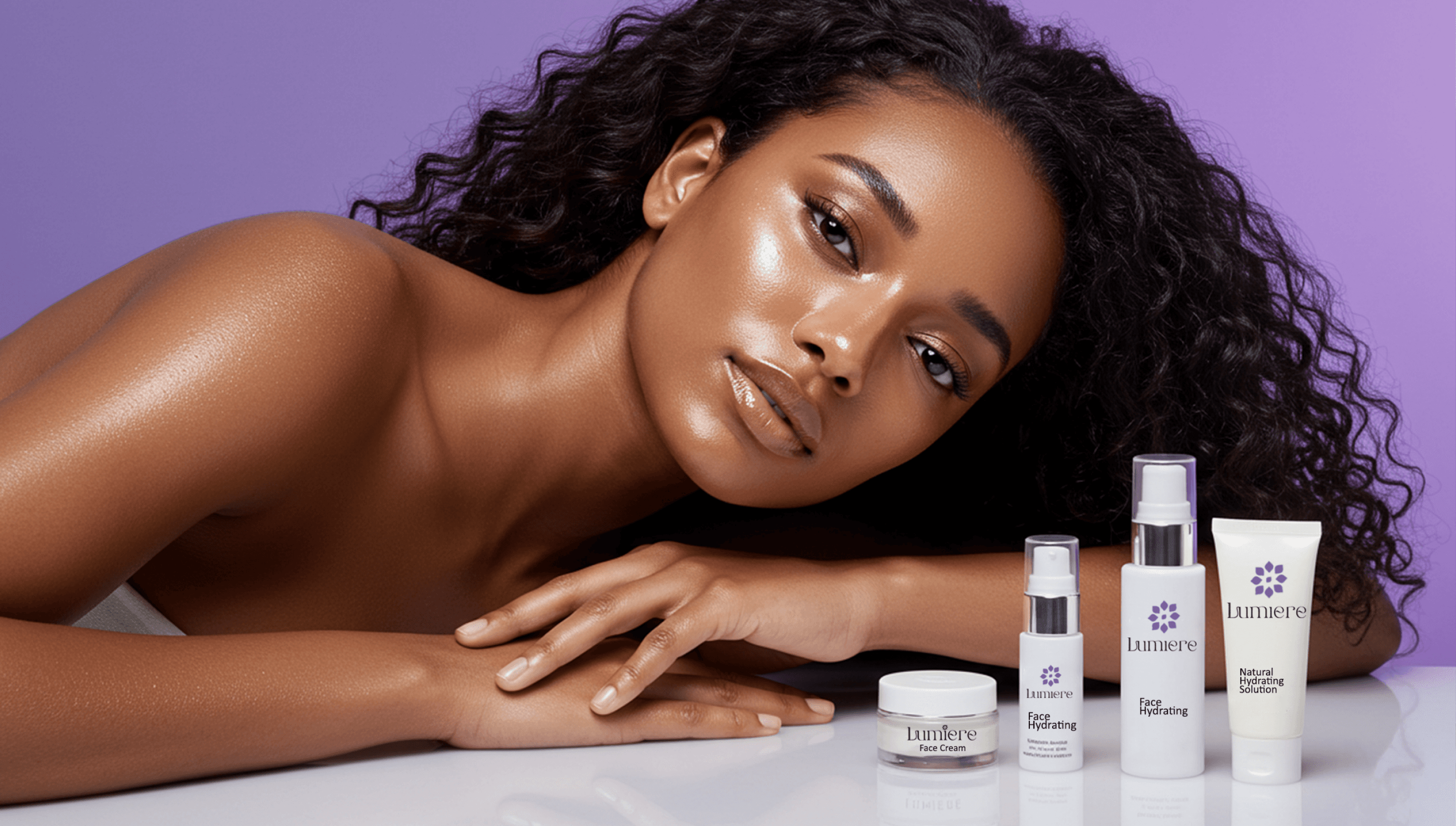
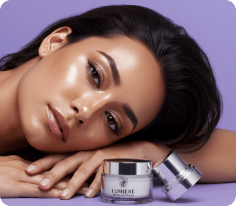
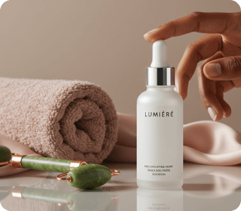
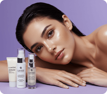
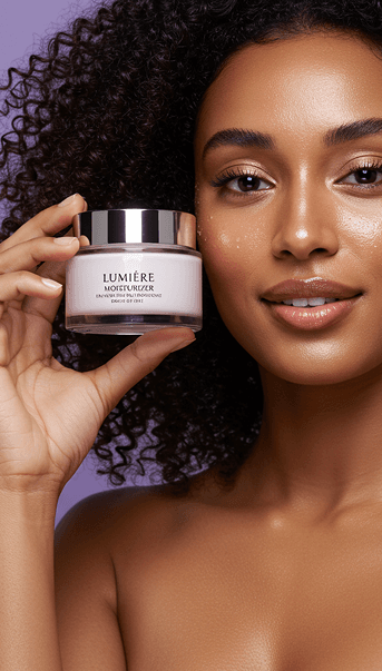
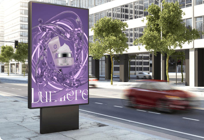
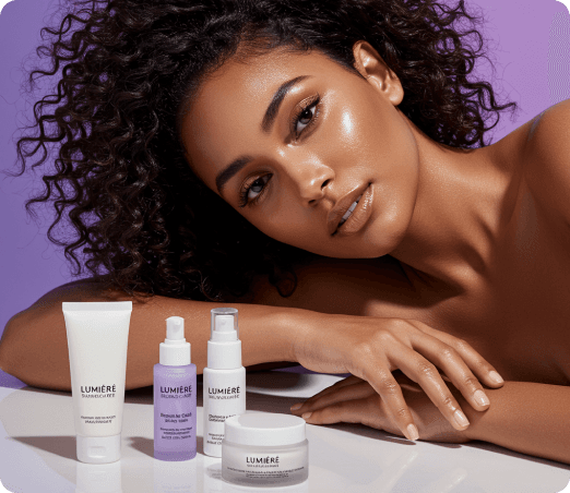
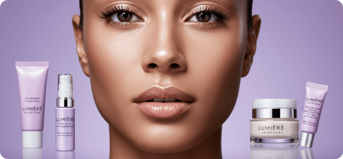
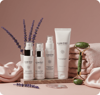
Lumiere is a skincare brand designed for women who appreciate elegance in simplicity.The brand speaks glow, softness, and effortless class a reflection of women who value quiet luxury and confident minimalism.
At DevianniesStudio, we were tasked with crafting a full brand identity and website experience that captured this spirit one that feels refined yet relatable, minimal yet warm, and premium without pretense.
Project
Lumiere
Project type
Brand Strategy
Equity
Skincare / Beauty
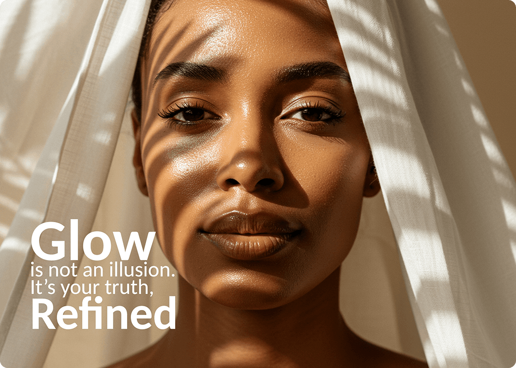
The skincare market is flooded with loud, overdesigned brands that promise instant perfection. Lumiere wanted to stand apart to celebrate real beauty in its most natural form.
The challenge was to build an identity that expressed this calm confidence a brand that doesn’t demand attention but effortlessly draws it.
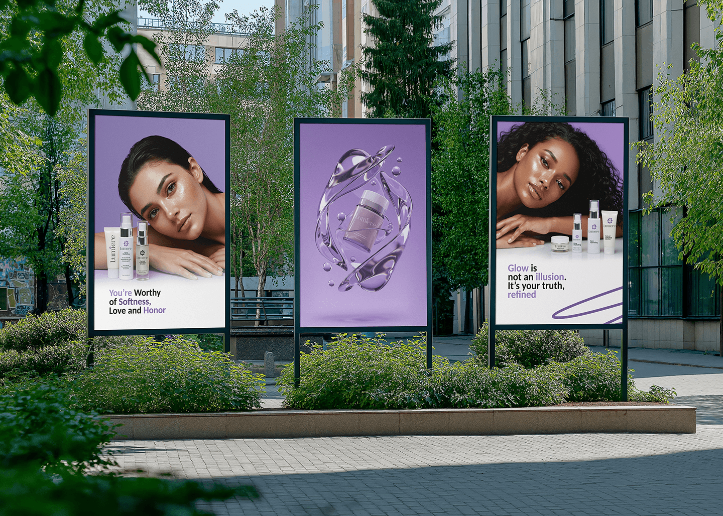
We needed to strike a balance between modern femininity and timeless sophistication, translating that feeling seamlessly across both brand and digital touchpoints.

Our goal was to create a cohesive visual and verbal language that
Every design decision had to reinforce Lumiere's promise that beauty can be soft, confident, and effortless.

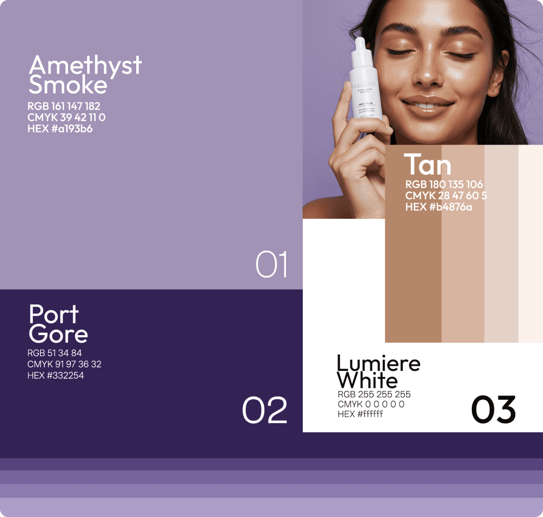
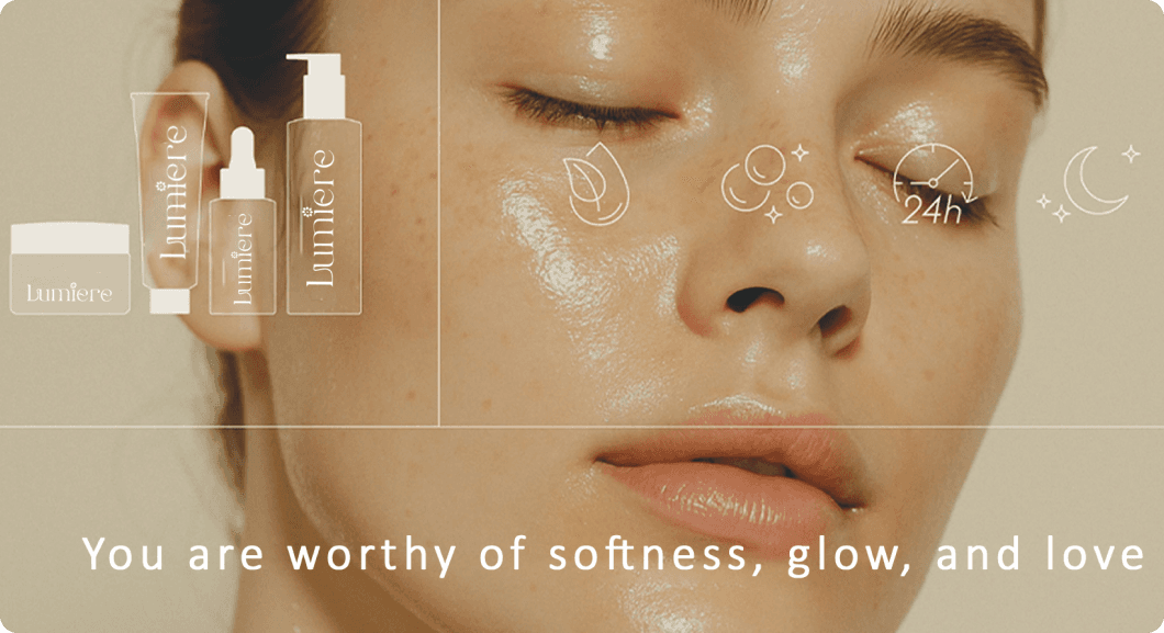
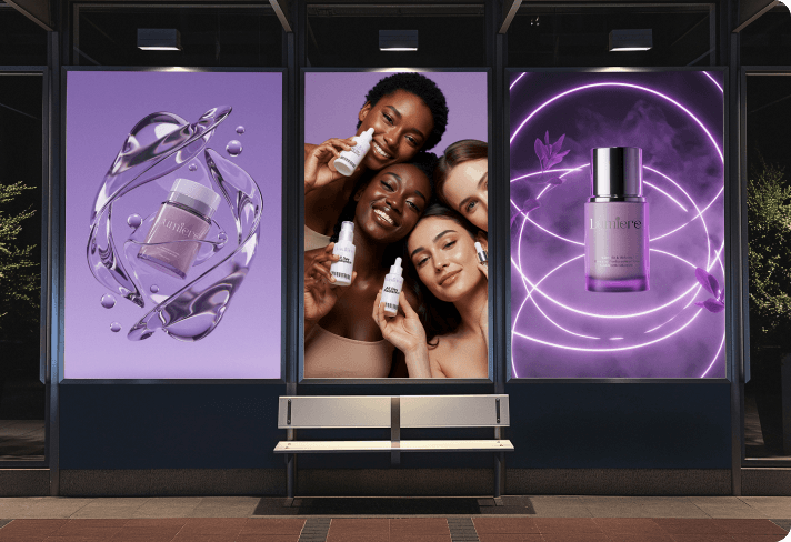
Through moodboards, tone exploration, and competitor analysis, we identified three key visual pillars: Purity, Warmth, and Balance.
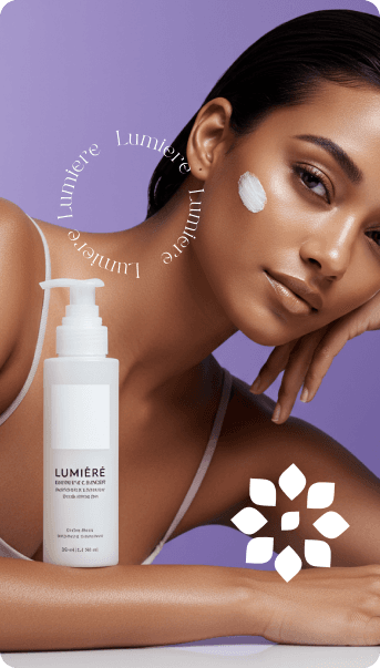
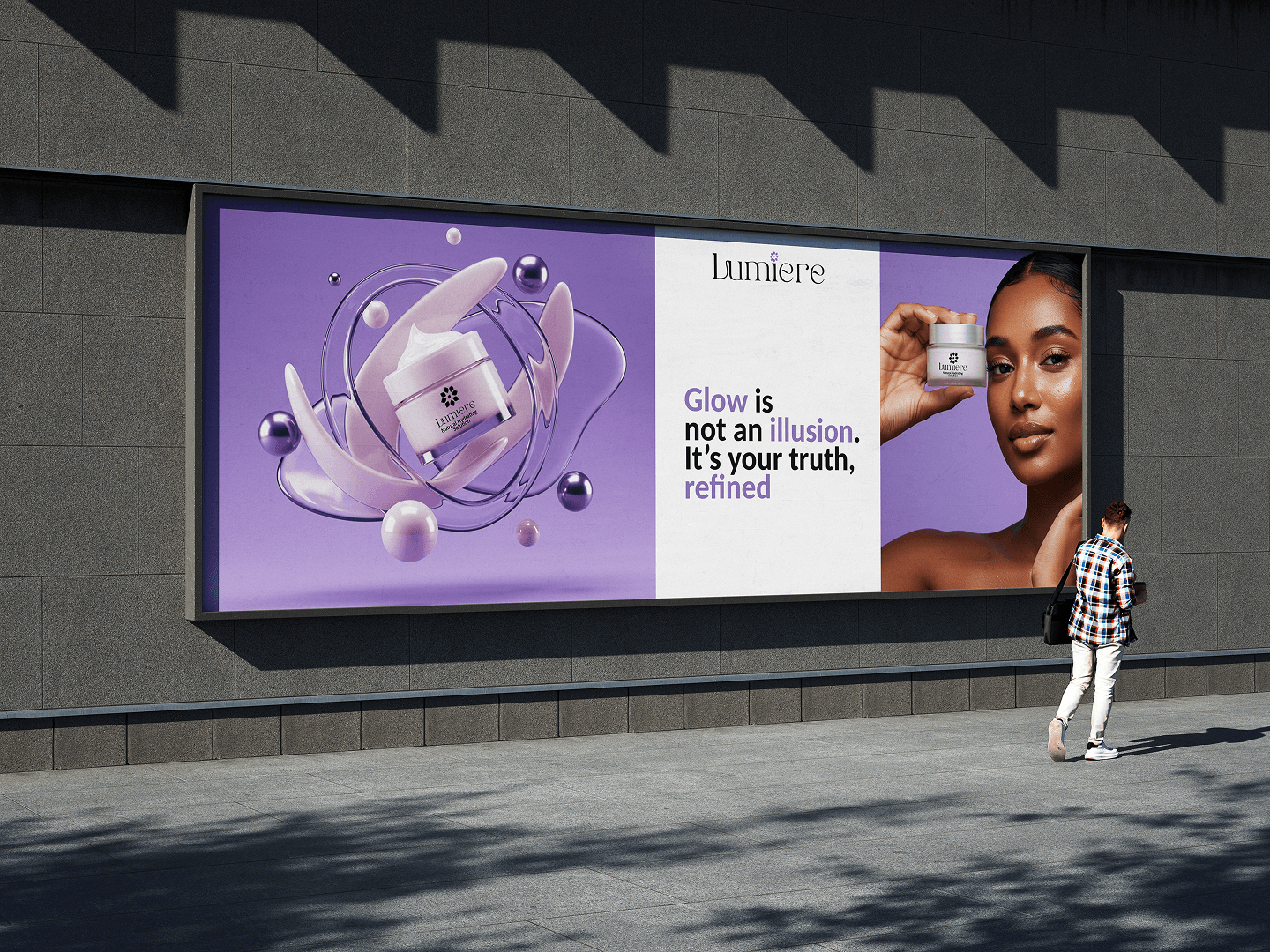
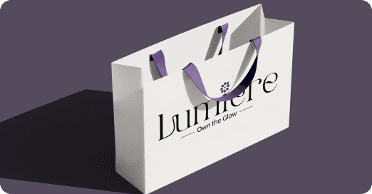
At the heart of Lumiere’s identity lies a minimal flower icon—a symbol of natural growth, radiance, and femininity. Each petal represents a key aspect of the brand philosophy: purity, softness, balance, and light.
The design is intentionally symmetrical and calm, mirroring Lumiere’s promise—skincare that brings balance and confidence through simplicity. It’s not just a flower; it’s a metaphor for glowing, thriving skin.

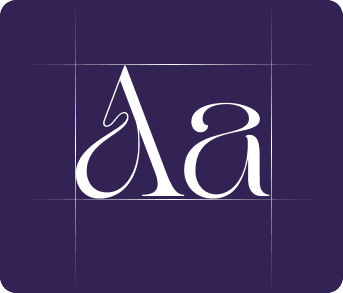
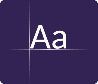
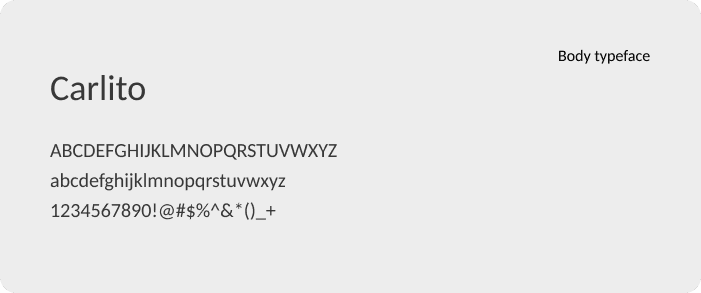
Typography & Color


Loved by 50+ brands across design, tech, and lifestyle
Let's create Magic